
Introduction
Creating a serene and inviting home environment begins with understanding the power of color. One color scheme that has gained immense popularity for its calming effects is the warm neutral palette. Warm neutrals, which encompass a range of shades from soft beige to gentle taupe, evoke feelings of comfort and tranquility. These colors are not just aesthetically pleasing; they play a crucial role in enhancing our emotional well-being. Studies have shown that the colors surrounding us can significantly influence our mood and mental state.
I still remember the first time I stepped into a friend’s newly renovated home adorned in warm neutral hues. The moment I crossed the threshold, a sense of peace washed over me. It was as if the walls were wrapped in a gentle embrace, inviting me to stay a while. “Color is the keyboard, the eyes are the harmonies, the soul is the piano with many strings,” said Wassily Kandinsky, a reminder that the right color choice can create a symphony of emotions in our living spaces.
“Creating a cozy reading nook is all about maximizing comfort in a small space. It’s about intentional design that serves both function and feeling.”
– Interior Design Magazine
Understanding Warm Neutrals
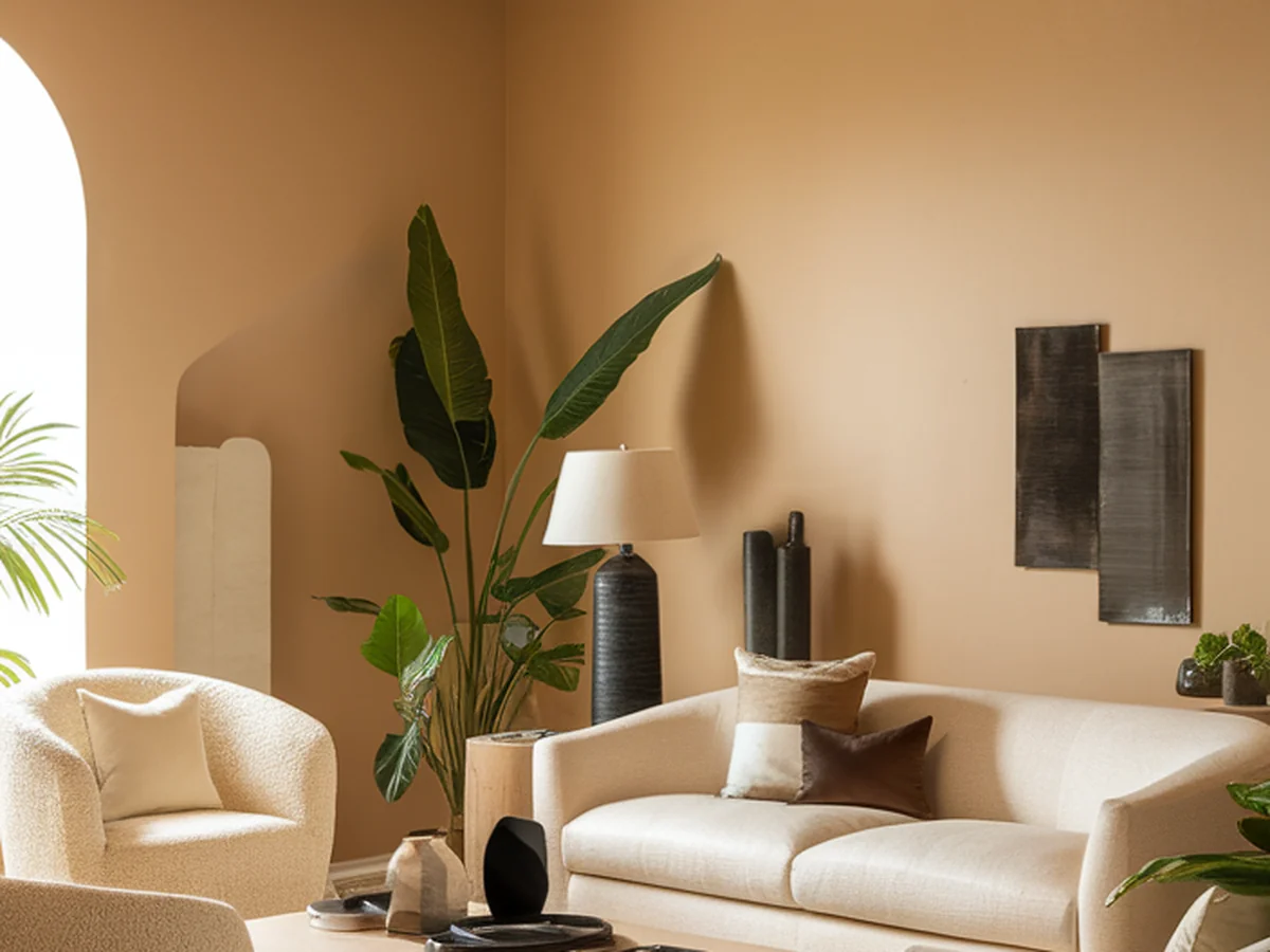
Warm neutrals are colors that blend a sense of warmth and softness, creating a welcoming atmosphere. Common shades include beiges, taupes, soft whites, and muted golds. These colors differ from cool neutrals, such as grays and blues, which can sometimes evoke a more clinical or stark feeling. Warm neutrals exude coziness and connection, making them ideal for spaces designed for relaxation and interaction.
The emotional responses elicited by warm neutrals are profound. They are reminiscent of natural materials, such as wood and stone, and can evoke feelings of warmth and comfort. When you walk into a room painted in a warm neutral color, you may feel a sense of calm, grounding, and safety. For instance, a palette consisting of beige, soft cream, and light taupe can create an inviting space that feels both spacious and intimate.
Here are a few examples of warm neutral palettes that you might consider:
| Palette Name | Color Shades | Suggested Room |
|---|---|---|
| Coastal Calm | Soft beige, seafoam green, sandy taupe | Living Room |
| Warm Embrace | Rich taupe, warm cream, muted gold | Bedroom |
| Earthy Retreat | Warm gray, terracotta, soft ivory | Kitchen |
This understanding of warm neutrals sets the stage for exploring their unique charm and the myriad benefits they bring to your home.
The Benefits of a Warm Neutral Color Scheme
Adopting a warm neutral color scheme for your home can create a calming atmosphere that promotes relaxation and mindfulness. Imagine returning home after a long day, greeted by soft, warm hues that embrace you like a gentle hug. These colors can help reduce stress levels, making your home a sanctuary from the outside world.
Additionally, warm neutrals have the remarkable ability to enhance natural light in your space. Soft beiges and creamy whites reflect light more effectively than darker shades, making rooms feel larger and brighter. This quality is particularly beneficial in smaller or dimly lit areas, where you want to create an illusion of space without sacrificing warmth.
Another significant advantage of warm neutrals is their versatility. These colors effortlessly blend with various decorating styles, from modern minimalist to rustic farmhouse. Their understated elegance allows you to play with different textures and accent colors without clashing, making it easy to refresh your space with seasonal decor.
Lastly, warm neutrals facilitate a seamless flow between rooms. By using a consistent palette throughout your home, you promote cohesion in design, leading to a harmonious living environment. Each room can maintain its character while still feeling connected to the others, enhancing the overall aesthetic of your home.
Choosing the Right Warm Neutrals for Your Space
When selecting warm neutral colors for your home, it’s essential to consider the lighting in each room. Natural light can significantly alter how a color appears; for instance, a shade may look different in the morning sun compared to the evening glow. Take the time to observe how light interacts with the space throughout the day before making your final decision.
To help you choose the perfect shade for different rooms, consider the following tips:
- Living Room: Opt for warm beige or soft taupe to create a cozy gathering space.
- Bedroom: Use muted creams or light taupes for a tranquil retreat.
- Kitchen: Soft whites or warm grays can enhance the feeling of cleanliness and brightness.
Moreover, it’s vital to consider your existing furniture and decor when selecting paint colors. A warm neutral will work best if it complements your current pieces instead of clashing with them.
You can utilize various tools and resources to test colors effectively. Paint swatches from your local hardware store are a great start, but consider using virtual apps that allow you to visualize paint colors in your space. These tools can help you see how different shades interact with your furniture and lighting, aiding in your decision-making process.
Incorporating Warm Neutrals with Furniture and Decor
Once you’ve chosen your warm neutral palette, the next step is to select furniture that complements these tones. Look for pieces in natural materials, such as wood, rattan, or linen, which harmonize beautifully with warm neutrals. Soft textures like plush fabrics or woven textiles can also enhance the overall coziness of your space.
Layering textures is a key element in creating depth within your warm neutral decor. Combining fabrics, woods, and metals can add visual interest and prevent your space from feeling flat. For example, consider mixing a plush beige sofa with a textured wool throw and a rustic wooden coffee table. This combination not only looks inviting but also encourages tactile interaction.
Accessorizing is another way to incorporate warm neutrals into your home. Art pieces, rugs, and throw pillows in similar shades can tie the room together and add personality. For instance, a warm-toned abstract painting can serve as a beautiful focal point while echoing your chosen color scheme.
Don’t forget the role of plants and natural elements in enhancing a warm neutral palette. Bringing in greenery can add life and vibrancy to your space while maintaining the serene feel of the color scheme. Whether it’s a large potted plant or delicate succulents, nature’s touch can elevate the overall ambiance of your home.
Creating Focal Points in Warm Neutral Spaces
Focal points are crucial in any design, as they draw the eye and create interest within a room. In spaces adorned with warm neutrals, it’s important to find ways to establish these visual anchors without overwhelming the serene atmosphere.
One effective method is to create an accent wall. A deeper shade of your warm neutral palette can serve as a backdrop for a striking piece of art or a statement piece of furniture. For example, a taupe accent wall can beautifully frame a vibrant painting, adding depth without disrupting the overall harmony of the space.
Another way to create focal points is through unique decor pieces. A bold sculpture or an intricately designed light fixture can serve as a conversation starter while contributing to the overall aesthetic. When working with warm neutrals, balance is key—consider incorporating darker or bolder accents to create contrast.
Here are some ideas for effective focal points in warm neutral rooms:
| Focal Point Idea | Description | Example |
|---|---|---|
| Accent Wall | A wall painted in a darker neutral to contrast with lighter hues | Taupe behind a beige sofa |
| Statement Furniture | A bold piece that stands out against the neutral backdrop | Dark wood coffee table |
| Unique Decor | Art or sculptures that draw attention and add personality | Large canvas print in warm tones |
By thoughtfully considering focal points, you can achieve a beautiful balance of warmth and contrast, making your warm neutral spaces both inviting and visually stimulating.
Sustainable Choices in Warm Neutral Design
In today’s world, sustainability is a crucial factor in home design. When creating spaces with warm neutrals, you can make eco-friendly choices that align with your aesthetic and values. Start by exploring eco-friendly paint options. Many brands now offer low-VOC or zero-VOC paints in a variety of warm neutral shades, ensuring that your color choices are safe for both your family and the environment.
Additionally, consider sourcing sustainable materials for furniture and decor. Look for pieces made from reclaimed wood, bamboo, or recycled materials. These options not only reduce waste but also add character and history to your home. If you have existing items that need a refresh, think about upcycling. A coat of warm neutral paint can breathe new life into a tired piece, making it feel modern and chic.
Highlighting brands or products that align with sustainable decor practices is also a great way to support eco-friendly initiatives. Many companies are now committed to producing sustainable home goods, offering a variety of options that fit within a warm neutral palette.
Embracing sustainable choices not only enhances the overall aesthetic of your home but also contributes to a sense of emotional warmth, knowing you are making responsible decisions for the planet.
Maintenance and Care for Your Warm Neutral Spaces
Once you’ve created your warm neutral haven, maintaining its beauty is essential. Start with best practices for keeping your walls and furnishings looking fresh. When cleaning, use gentle solutions that won’t damage your paint or upholstery. For fabric items, regular vacuuming and spot cleaning can help keep them looking their best.
When it comes to seasonal updates, consider refreshing your space with new accessories or textiles that align with your warm neutral palette. Soft throw blankets or seasonal decor in complementary colors can add a touch of variety without straying from your overall scheme.
Decluttering and organization play a significant role in enhancing the serene feel of your home. Keeping surfaces tidy and organized allows the warm neutral colors to shine, contributing to a peaceful environment. A well-organized space is visually appealing and promotes a sense of calm and clarity.
Real-Life Transformations: Case Studies
To inspire your journey towards embracing warm neutrals, let’s explore some real-life transformations. One standout example is a small urban apartment that was transformed from a dark, cramped space into a light-filled oasis. The homeowner chose a palette of soft beiges and muted whites, instantly brightening the environment.
The transformation involved stripping away outdated wallpaper and replacing it with a fresh coat of warm neutral paint. The result was a stunning before-and-after that left friends and family in awe. As the homeowner remarked, “Changing the color of my walls was like breathing new life into my space.”
Challenges are a part of any renovation, and this homeowner faced the dilemma of working with limited natural light. By selecting lighter shades and incorporating mirrors to reflect light, they successfully created an airy atmosphere. Designers and influencers known for using warm neutrals often emphasize the importance of lighting and color choice, showcasing how these elements can dramatically alter a room’s feel.
Conclusion
Embracing a warm neutral color scheme can transform your home into a serene retreat, offering numerous benefits that enhance both aesthetics and emotional well-being. From the calming atmosphere created by soft hues to the seamless flow between rooms, warm neutrals provide a versatile and inviting backdrop for your living space.
As you embark on this journey of color exploration, remember that the colors you choose can significantly impact your mood and the overall feel of your home. So, take the plunge and incorporate warm neutrals into your design. After all, your home should be a reflection of your personality and a sanctuary that nurtures your spirit.
“Colors are the smiles of nature,” said Leigh Hunt, and by embracing warm neutral tones, you can create a space that radiates warmth and serenity.
Frequently Asked Questions
What are warm neutral colors?
Warm neutral colors are shades that evoke a sense of warmth and comfort, typically including hues like beige, taupe, soft whites, and muted golds. Unlike cool neutrals, which may lean towards grays and blues, warm neutrals create a cozy and inviting atmosphere, making them ideal for living spaces where relaxation is key.
How do I choose the right warm neutral for my room?
When selecting a warm neutral color for your room, consider the existing lighting and the mood you wish to create. Observing how natural light interacts with your space at different times of day can help you make an informed choice. Additionally, think about your furniture and decor, ensuring that the color you choose complements your existing pieces.
Can warm neutrals work in smaller spaces?
Absolutely! Warm neutrals can make smaller spaces feel larger and more inviting. Lighter shades of warm neutrals reflect natural light, creating an illusion of space. Paired with strategic lighting and thoughtful decor, warm neutrals can enhance the overall atmosphere of compact areas, making them feel open and airy.
How can I add interest to a warm neutral room?
To add interest to a warm neutral room, consider layering different textures and materials. Incorporating textiles like cozy throws, plush rugs, and varied fabrics can create depth. Additionally, using accent pieces in darker or bolder colors can provide contrast while maintaining the serene feel of warm neutrals.
What are some eco-friendly options for warm neutral decor?
Eco-friendly options for warm neutral decor include low-VOC or zero-VOC paints, sustainable furniture made from reclaimed or recycled materials, and upcycled decor items. Many brands now focus on sustainability, offering a range of products that align with eco-friendly practices while allowing you to maintain your desired aesthetic.